How To Use Color
Color is one of the most important elements of design. If used correctly, color can be used to establish a brand identity or make an advertisement more eye-catching. It is important to understand how the color wheel works in order to learn how to use color correctly.
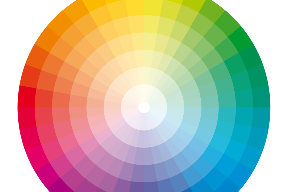
Monochromatic is a color combination of shades of one color in different values. A monochromatic scheme can be pleasing to the eye. Analogous colors can also have the same impact. These color schemes consist of at least 2 colors that are next to each other on the color wheel, like yellow and green. Complementary colors are colors that are opposite on the color wheel, which tends to make each color stand out more.
It is important to keep in mind that colors have different temperatures and that can also make a huge difference when using colors together. Reds and yellows tend to be more warm colors, while blues and purples are cool.
Different colors have different meanings and they are often using to create a mood for a brand. Blue is a very trustworthy color, while red can be seen as aggressive. It is important to consider the message you are trying to send about your company when choosing your colors.
"Color does not add a pleasant quality to design - it reinforces it."